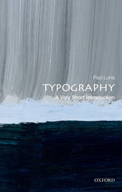
My guest in this week’s programme is Paul Luna, who’s the author of a recent book on typography in the Very Short Introductions series from Oxford University Press. Paul is also emeritus professor of typography and graphic communication at the University of Reading. And – full disclosure – Paul and I were colleagues at OUP in the 1990s, where he headed the design department in the academic division and I was a commissioning editor.

Paul has been responsible for the typographic design of a host of major publications, including editions of the Bible and Shakespeare, and reference works including the two most recent editions of the Shorter Oxford English Dictionary. Paul’s university webpage sums up his main area of professional interest as ‘the design of complex text, especially dictionaries, in both paper and electronic formats’.
Despite knowing Paul for years, I had never asked him about his family origins. I did so just before our interview and couldn’t have hoped for a better answer: Paul’s family are from Ivrea in Piedmont, North west Italy, the company town that was home to the famous Olivetti typewriter works. Icons of design, black text on a white page – I think there must have been something in the water, or some genetic inheritance at work.
Paul didn’t grow up among the glass and steel structures of Camillo Olivetti’s factories, but in South London. So when I visited him at home in Oxfordshire in November, I began by asking him when he had first taken an interest in type.
